Kante: a design system an AI can read
What does a design system need to contain so that an AI builds exactly the components I want, and not the ones it considers likely? I built one and measured it in real runs.
- Type
- Design system with measured AI runs
- Role
- Concept, tokens, specs, check scripts, reference and evaluation
- Period
- November 2026
- Tech
- W3C design tokens, Style Dictionary, Tailwind v4, Radix, Claude Code (Opus and Haiku)
Summary
An AI builds an interface in minutes. Without guidance, though, it builds the average of what it knows and invents every value again. For a brand with its own language that is not time saved, it is rework.
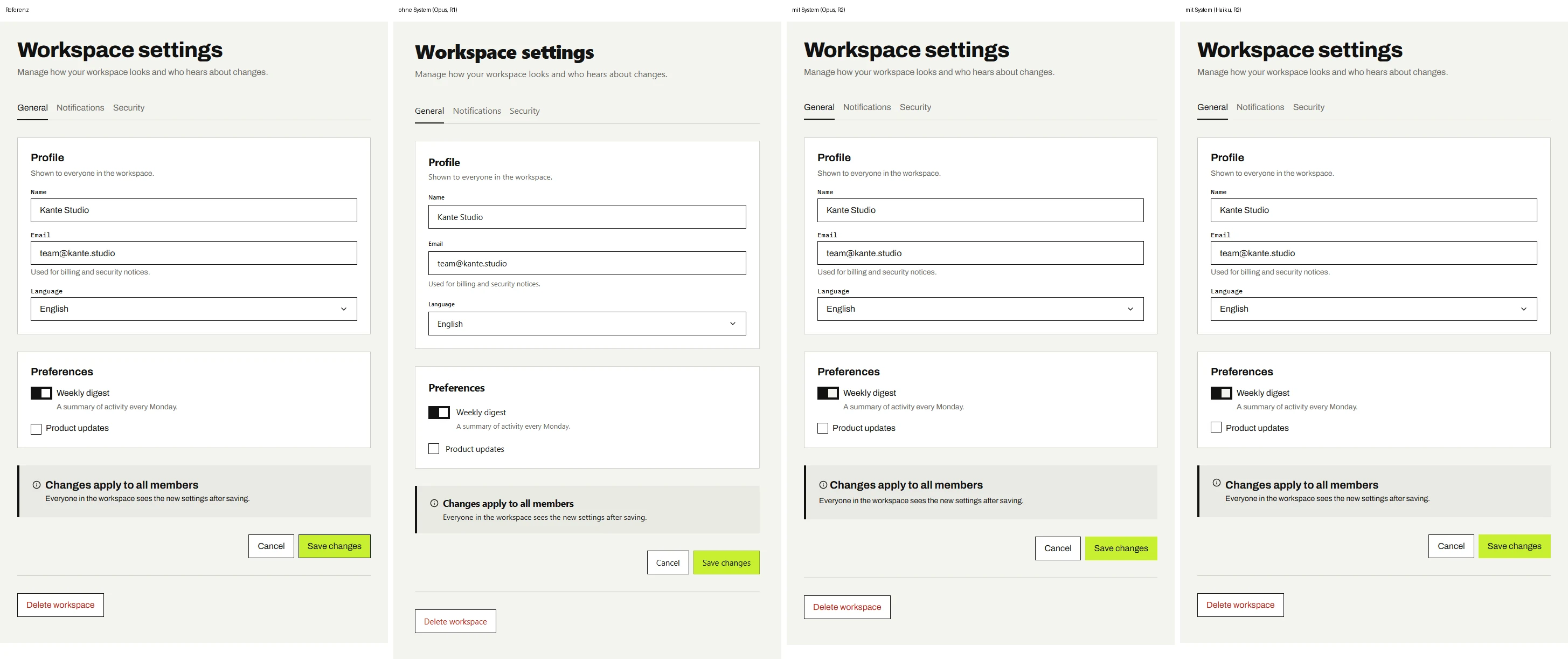
I built Kante, a deliberately angular system, and had a fresh AI session solve the same task three times: without the system, with the system on a large model and with the system on a small one. Without the system the checks found 263 values that are not tied to any token. With the system it was 0 after 2 rounds, on the small model too.
In numbers
The problem
Without a system the AI guesses, and it guesses quite well
The run without the system only got two screenshots of the reference. At first glance the result looks right. That is the real risk: nobody would reject it in a review.
Underneath, 116 colour values sit directly in the code, 28 different ones. Kante has 15. The model estimated the ink from the image as #141414 instead of #111111, and almost the same grey surface has two values one step apart. If I change a colour in the system, none of it arrives.
runs/2026-11-11-baseline-r1/components/button.tsx
  primary: {
    rest: "border-[#8fb31a] bg-[#c8f031] text-[#141414]",
    hover: "enabled:hover:bg-[#b6dd22]",
    active: "enabled:active:bg-[#a3c81c] enabled:active:border-[#141414]",
    hoverStatic: "bg-[#b6dd22]",
    activeStatic: "bg-[#a3c81c] border-[#141414]",
  },
  secondary: {
    rest: "border-[#141414] bg-white text-[#141414]",
    hover: "enabled:hover:bg-[#ebebe6]",
    active: "enabled:active:bg-[#dcdcd5] enabled:active:shadow-[inset_0_0_0_1px_#141414]",
    hoverStatic: "bg-[#ebebe6]",
    activeStatic: "bg-[#dcdcd5] shadow-[inset_0_0_0_1px_#141414]",
  },
  danger: {
    rest: "border-[#141414] bg-white text-[#c0261c]",
    hover: "enabled:hover:bg-[#fbe7e4]",
    active: "enabled:active:bg-[#f5d3ce] enabled:active:shadow-[inset_0_0_0_1px_#c0261c]",
    hoverStatic: "bg-[#fbe7e4]",
    activeStatic: "bg-[#f5d3ce] shadow-[inset_0_0_0_1px_#c0261c]",
  },
};Structure
Three layers, and the AI may only use the middle one
All values live as JSON in the W3C design token format. Style Dictionary turns them into CSS variables, Tailwind classes and readable docs. There is exactly one source.
The base layer holds raw values such as ink.900. The semantic layer says what a value is for: color.text.default. The component layer exists only where a component really differs. The AI may only use semantic and component tokens. That way it searches by purpose, not by looks.
One token through every layer
- Basebase.color.ink.900#111111
- Semanticcolor.text.default#111111Body text, headings and labels on page, raised and sunken surfaces. Also text on status backgrounds.
- Semanticcolor.action.secondary.text#111111Label of secondary actions. Destructive secondary actions use text.danger instead.
- Codetext-ds-action-secondary-textreference/components/button.tsx
A token with purpose and limit
tokens/semantic/color.json
      "muted": {
        "$value": "{base.color.ink.500}",
        "$description": "Secondary text: hints, help text, metadata. Only on page and raised surfaces. Never on sunken surfaces or status backgrounds, the contrast is too low there.",
        "$extensions": {
          "de.axkl.pairs": [
            {
              "surface": "color.surface.page",
              "min": 4.5
            },
            {
              "surface": "color.surface.raised",
              "min": 4.5
            }
          ]
        }
      },
"inverse": {The spec as data
specs/button.json
  "states": [
    { "name": "default", "tokens": { "primary.bg": "color.action.primary.bg", "primary.text": "color.action.primary.text", "secondary.bg": "color.action.secondary.bg", "secondary.text": "color.action.secondary.text", "secondary.border": "color.action.secondary.border", "danger.text": "color.text.danger", "radius": "radius.control" } },
    { "name": "hover", "tokens": { "primary.bg": "color.action.primary.bg-hover", "secondary.bg": "color.action.secondary.bg-hover", "duration": "motion.quick" } },
    { "name": "focus", "tokens": { "outline": "color.border.focus" } },
    { "name": "active", "tokens": { "primary.bg": "color.action.primary.bg-hover", "secondary.bg": "color.action.secondary.bg-hover" } },
    { "name": "disabled", "tokens": { "bg": "color.surface.sunken", "text": "color.text.default", "border": "color.border.default" } }
  ],
  "a11y": {
    "role": "button",
    "keyboard": ["Enter and Space activate", "Tab moves focus"],
    "mustMatch": ["button[type]"]
  },
  "rules": [
    "At most one primary button per view.",
    "Danger is a secondary button with a text.danger label and the same outline; it never has a red background.",
    "An icon-only button needs aria-label.",
    "Disabled buttons use the disabled attribute, the disabled tokens and 50% opacity on the whole button.",
    "Focus ring: 2px outline in border.focus with 2px offset."
]Hard rules in AGENTS.md
AGENTS.md
## Hard rules
1. No colour literals: no hex, rgb(), hsl(), oklch().
2. No px, rem or em values, neither in arbitrary Tailwind values (`h-[13px]`) nor in `style`.
3. No Tailwind palette colours (`bg-gray-100`, `text-blue-600`, `bg-white`, `text-black`).
4. Spacing only with `*-ds-*` utilities; never `p-4`, `gap-3`, `mt-6`.
5. Corners only `rounded-none`. No `rounded`, `rounded-md`, `rounded-full`.
6. No shadows. Elevation comes from borders.
7. Text only with `type-*` utilities; no `text-sm`, `font-bold`, `leading-*`, `tracking-*`.
8. Never reference `--ds-base-*` or `ds-base-*`.
9. Implement exactly the states each spec lists, with the tokens it names.
10. A spec's `rules` override your own taste.
11. No numeric size utilities (`size-5`, `w-10`, `h-6`, `size-4`). Control and icon sizes come from component tokens: `size-ds-checkbox-size`, `w-ds-switch-width`, `h-ds-switch-height`, `size-ds-switch-thumb`, `size-ds-icon-s`. `w-full`, `w-1/2` and `min-h-screen` are fine.
Decisions
What makes the system readable
- One source, many outputs. Tokens exist once as JSON. CSS, Tailwind classes, types and docs are generated from them. An AI cannot read something that says two different things in two places.
- Names by purpose, not by looks. color.text.muted instead of grey-500. Searching by purpose finds the right token even when two colours look the same.
- Limits in the description. Every token says where it does not belong, for example “never on sunken surfaces”. Exactly these sentences prevent the typical mistakes.
- Contrast as data, not as hope. Allowed text and surface pairs are stored on the token. If a pair falls below WCAG AA, the build fails.
- Finished text styles. type-heading-m instead of size, weight and line height one by one. Fewer degrees of freedom mean fewer wrong combinations.
- Rules a script can check. Every hard rule in AGENTS.md has a check. What cannot be checked goes into the specs, not into the instruction file.
- Fix the system, never the output. When an AI builds something wrong, I change the system and let it build again. That closes each gap once instead of in every prompt.
Runs
Measured, not claimed
Every run is a fresh AI session without prior knowledge, in a folder of its own. The task is the same for all: eight components in every state and a settings screen built from them. The run with the system gets tokens, specs, check scripts and AGENTS.md, but never the reference.
A script counts: values not tied to a token, contrast violations in the rendered result, missing states and missing accessibility attributes. I judge the visuals myself.
In the first round, 11 (Opus) and 4 (Haiku) findings remained with the system. Their causes were in the system, not in the models.
| Run | Model | Round | Total | Raw values | Contrast | States | Accessibility |
|---|---|---|---|---|---|---|---|
| without system | Opus | 1 | 263 | 262 | 0 | 0 | 1 |
| with system | Opus | 1 | 11 | 11 | 0 | 0 | 0 |
| with system, small | Haiku | 1 | 4 | 4 | 0 | 0 | 0 |
| with system | Opus | 2 | 0 | 0 | 0 | 0 | 0 |
| with system, small | Haiku | 2 | 0 | 0 | 0 | 0 | 0 |
What the first round uncovered in the system
01
Finding: Every run, and my reference too, sized checkbox, switch and icons with number classes like size-5 or h-6.
Change to the system: Component tokens for these sizes and a new check rule. I rescored every first-round run with the stricter rule.
Reason: Sizes were the only area without tokens. The spec named pixels as text, so every model translated them on its own.
02
Finding: Opus put the page padding outside the maximum column width. The content became 64 px wider.
Change to the system: The screen spec now says the column is centred and includes the padding.
Reason: The spec allowed both readings.
03
Finding: The description of a text style named h3, the card spec asked for the level that fits the outline. Each model resolved the contradiction differently.
Change to the system: One rule in one place: the heading level follows the outline.
Reason: Two sources in the system contradicted each other.
04
Finding: Haiku mixed a controlled Radix element with a static preview in the dialog. The page threw an error on load.
Change to the system: The dialog spec now fixes the structure.
Reason: It only asked for “Radix Dialog”. The pattern of my reference was written down nowhere.
Try the system
The reference components
These components are the reference, built from semantic tokens only. You can use them, by keyboard too.
Profile
Shown to everyone in the workspace.
Enter a full address, like name@example.com.
Preferences
A summary of activity every Monday.
What I learned
- The AI finds the gaps. Every deviation in the first round pointed to a place where the system was ambiguous or silent. That makes the runs the best test of the system itself.
- A small model is enough when the system carries the load. Haiku with the system reaches the same result as Opus with the system. In practice that saves time and money.
- The difference is not in the screenshot. Without the system the result looks almost right. Looking only at pictures, you would not notice that every value is copied instead of linked.
Limits
- There was one run per variant and round. That shows a direction, not a statistic.
- I tightened the check rule for sizes after the first round. To keep the numbers comparable, every run is scored with the same rule.
- The checks do not count errors on page load. I checked them for every run separately and wrote them down.
- One agent briefly put a helper file into the shared parent folder of the runs. It says it read nothing there. That cannot be verified.
What I take away
A design system for AI is not a style guide with more text. It is a set of decisions that exist as data and can be checked. Then even a small model builds what I mean.
Next project