Booking engine, 13 years later
In 2013 I designed a booking flow for hotels that still runs on many hotel websites today. This is how I would build it now: mobile first, honest prices from the start and a checkout with six fields instead of around 25.
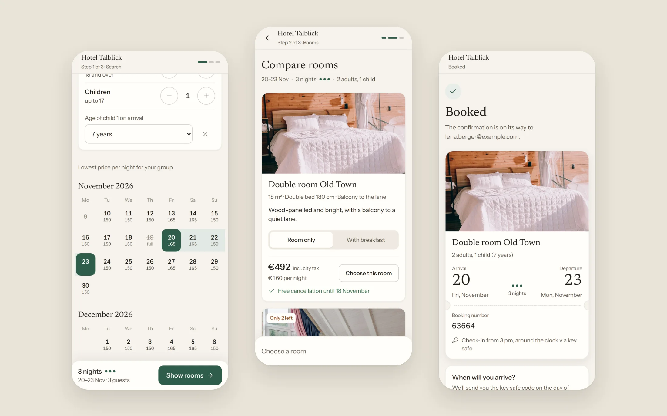
- Type
- Concept redesign with a clickable prototype
- Role
- 2013: concept and UX of the original flow. 2026: audit, concept, UI and prototype
- Timeframe
- November 2026
- Platform
- Web, mobile first, light and dark theme
- Stack
- Next.js, React, TypeScript, built with Claude Code
Summary
A booking flow is where interest turns into revenue. I looked at how the flow runs on a hotel website today and measured it on a phone against what guests know from the big booking platforms.
I'm not allowed to show the original screens. Every before view is therefore a schematic redraw: same sequence, same problems, without logo, hotel or original graphics. It is based on a walk through the public flow at 375 px width on 9 November 2026.
What stood out
I went through the flow on a phone from choosing dates to the guest details and stopped before submitting. The problems are in the order of questions, in how prices are shown and in the form.
Each comparison below shows the redrawn flow on the left and the new prototype at the same step on the right. Numbered squares mark the findings, followed by what changed and why.
Mobile, step by step
Before and after
Step 1 · Search
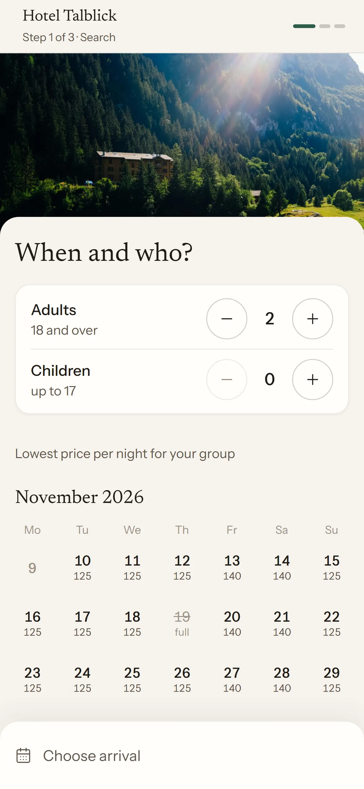
Guests first, then the price
Before, redrawn
After, prototype
What stood out
- 1Guests come after the dates, with 1 adult as the default.
- 2So the first price is for one person: €240 for a double room. With 2 adults it becomes €390.
- 3Families are sent to phone and email (“Dear parents …”), even though the flow has a field for children.
What changed
- Adults and children come before the calendar, with 2 adults as the default.
- Each child's age on arrival is asked, because it sets the price.
- Rooms that don't fit the group don't show up at all. The family room appears from 3 guests.
Why
The price depends on the group. Seeing €240 first and then €390 feels like a trick, even when both numbers are correct. Double rooms are mostly booked by two people, so 2 is the more honest default.
Families are not an edge case for a holiday hotel. When the flow sends them to reception, the booking often goes to a platform that can handle children.
Step 1 · Calendar
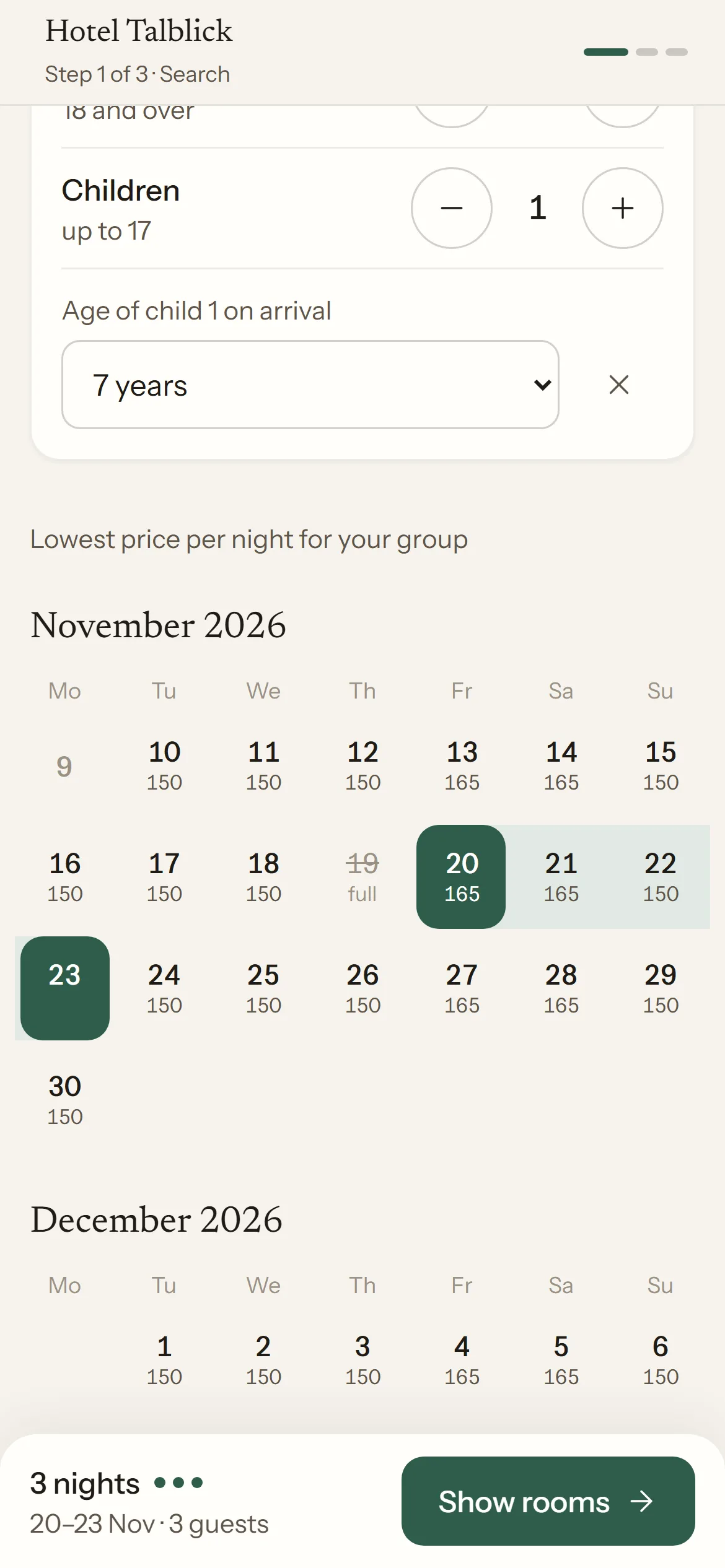
Prices in the calendar and no jump when tapping
Before, redrawn
After, prototype
What stood out
- 1Available days are only shaded. You can't see whether the weekend costs more, and the chosen stay isn't highlighted.
- 2On a phone only one month is shown. Stays across the month change need the small arrows.
- 3After the first tap the heading changes to “Choose departure date”, the content shifts, and the second tap hits a different day.
What changed
- Each day shows the lowest price per night for the chosen group. Full days are crossed out.
- Four months are stacked, scrolled with the thumb instead of arrows.
- The stay is shown as a band, and the heading stays put. What to do next is in the fixed bar at the bottom.
- Each day is a button labelled with its date and price. Before, days couldn't be focused, so neither keyboard nor screen reader could use the calendar.
Why
On a phone, a missed tap is not a cosmetic issue, it's a wrong date. And the price per day answers the question guests have anyway when picking dates: is the weekend more expensive, would a day earlier be cheaper?
Step 2 · Rooms
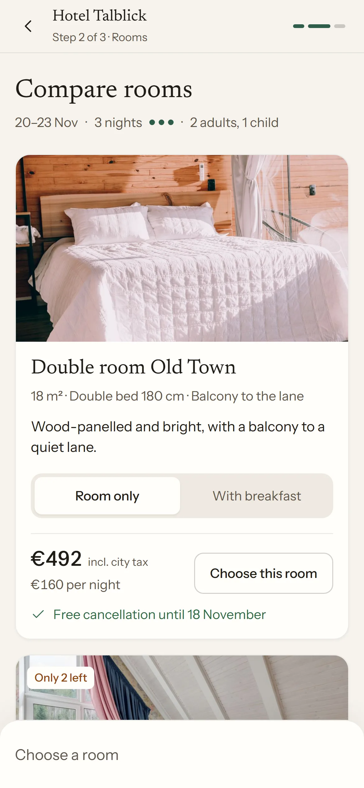
Compare rooms instead of being assigned one
Before, redrawn
After, prototype
What stood out
- 1One room is preselected. The others are hidden behind “Show all room types”.
- 2The list is plain text with name and price. Two rooms cost the same and nothing says how they differ. Some rooms have neither photos nor a description in their detail view.
- 3There is only a total, no price per night and no specific cancellation deadline. Tapping the room that's already selected does nothing, and no continue button is visible.
What changed
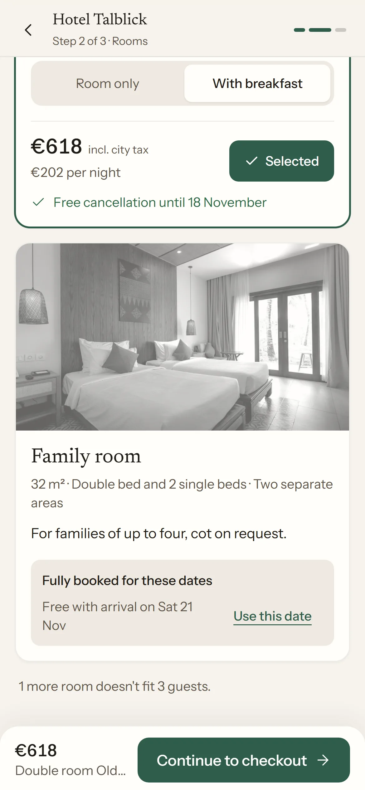
- All fitting rooms are listed as cards: photo, size, bed and what sets them apart.
- Breakfast can be added right on the card, and the price updates immediately.
- The total including city tax is the big number, with the price per night and the free cancellation deadline below.
- Fully booked rooms stay visible, greyed out, and suggest the next available arrival date.
Why
Guests who get a room assigned compare elsewhere, usually on a platform. The choice between two rooms is made with photos and hard facts like a balcony or step-free access, not with the room's name.
“Until when can I cancel for free?” is the key trust question when booking a hotel. So the answer sits next to the price, not in the terms.
Step 3 · Checkout
Six fields instead of around 25
Before, redrawn
After, prototype
What stood out
- 1No field has a label, only placeholders in 12 px text. iOS zooms in on every focus, and what the field was for disappears while typing.
- 2Title is required, a birthday for every guest too, and all fellow guests are asked for here. For 2 guests that added up to about 25 fields.
- 3Country is a free text field, email a plain text field without the email keyboard.
- 4The €12 city tax only appears in the form. The price jumps from €390 to €402 here.
What changed
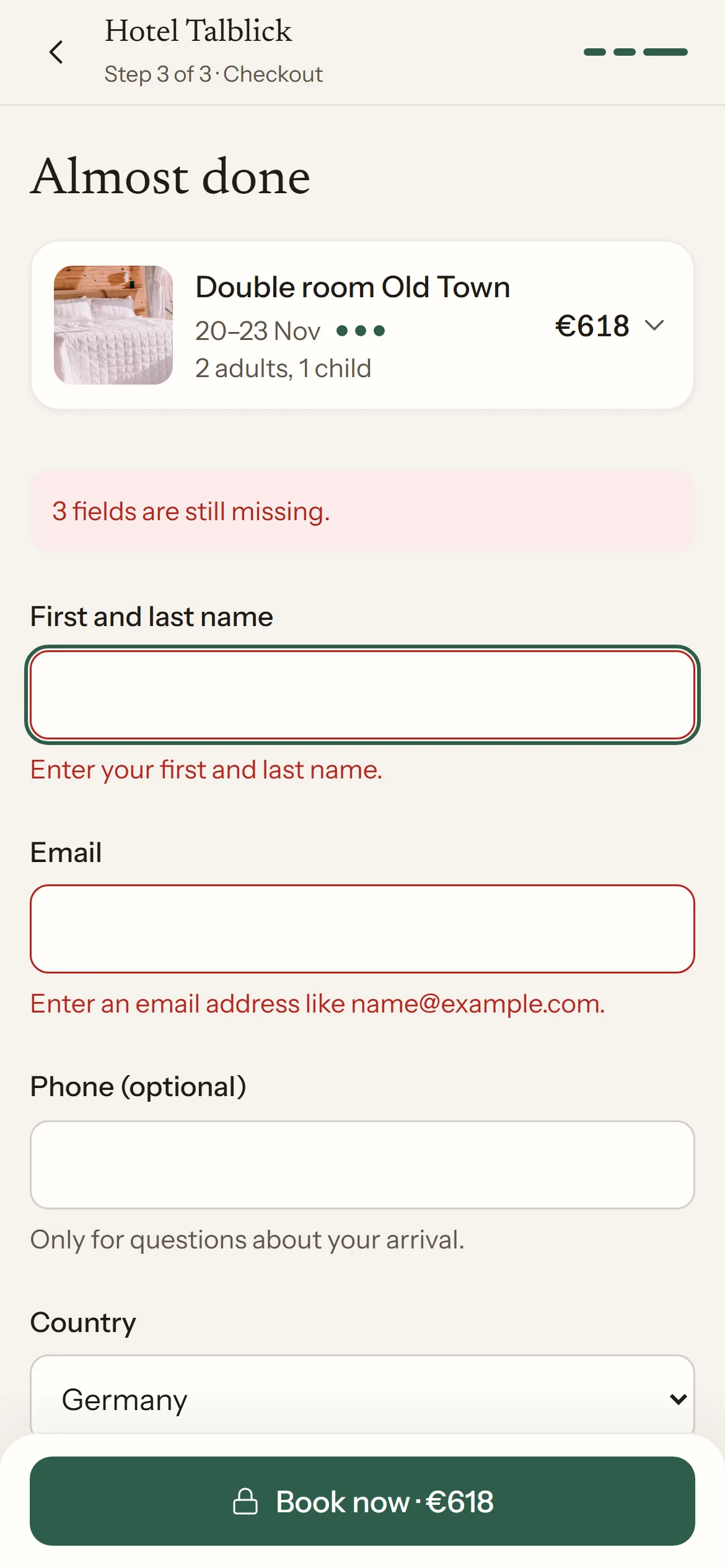
- Only name, email and payment are required. Phone and requests are optional, and country is a selection.
- Every field has a label above it. Fields are 48 px tall with 16 px text, the right keyboard and autofill.
- Errors appear right at the field and as a summary at the top. Focus moves to the first missing field.
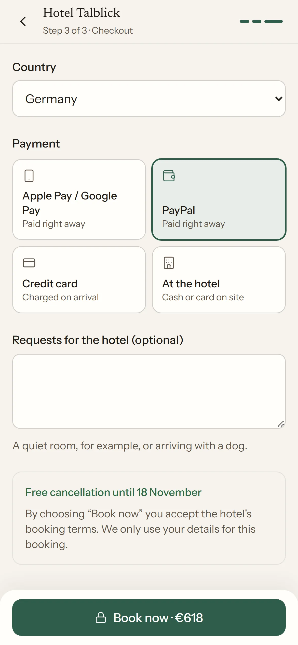
- The amount is on the book button, and the summary with every item can be expanded. Apple Pay, Google Pay, PayPal, credit card and paying at the hotel are on offer.
Why
Every required field is a chance to give up, and on a phone every field costs more than on a computer. The hotel needs dates of birth at the earliest for the registration form at check-in. So they move there, after the booking.
A price that rises in the last step feels like a trick, even if it's only €12 of city tax. In the prototype the final amount is fixed from the room card onwards.
All steps
A fixed bar and clear progress
Before, redrawn
After, prototype
What stood out
- 1Logo, address, contact details and an SSL badge sit above every step. The actual content starts further down.
- 2There is no progress indicator on phones. Steps are greyed-out headings in the page flow, while desktop shows a bar with “13 %”.
- 3The continue button sits in the page flow, with the footer, map and opening hours directly below.
- 4The request for the arrival time is in the footer, where hardly anyone reads it.
What changed
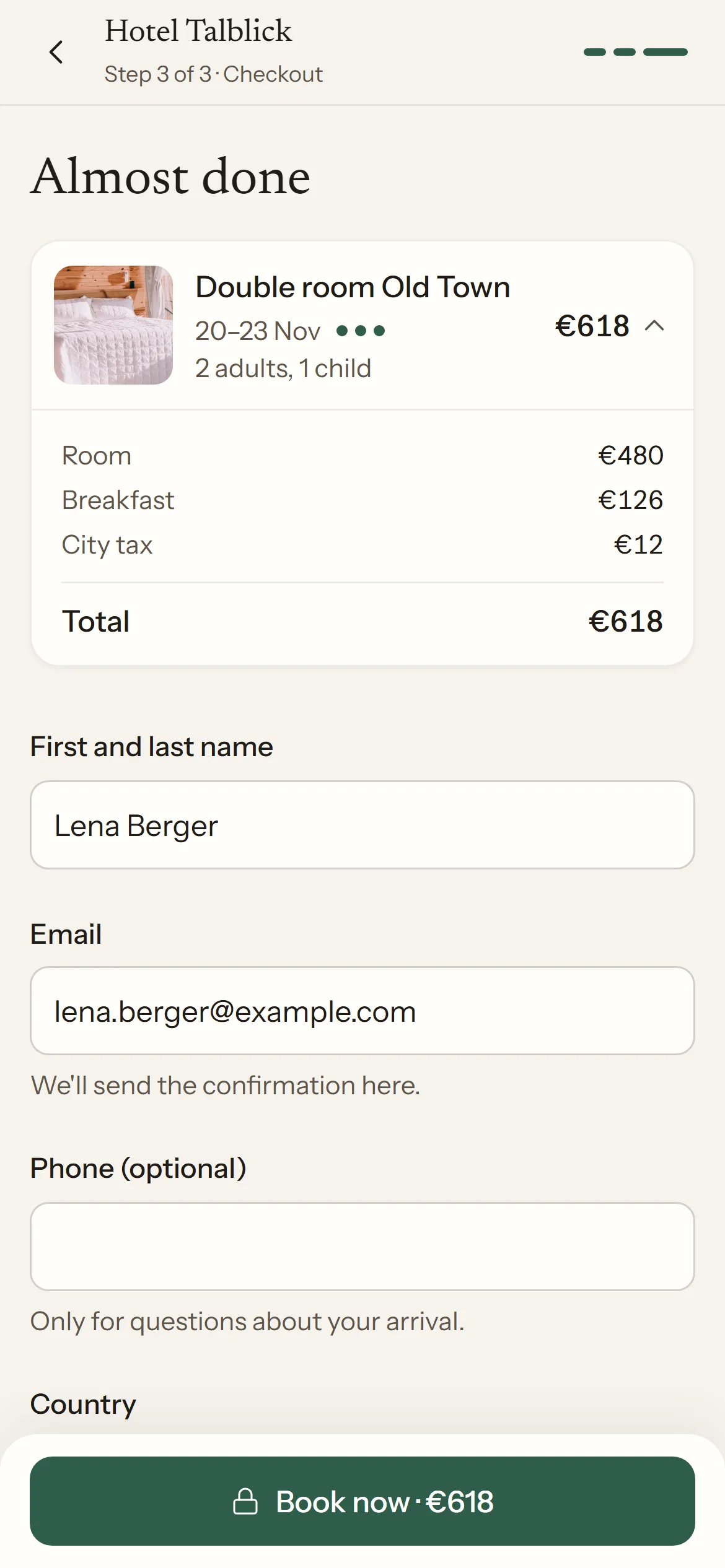
- The header holds only the hotel name, “Step 2 of 3” and three short bars. The back arrow goes one step back without losing anything.
- The main action sits in a fixed bar at the bottom of every step, within thumb reach, with the current price next to it.
- After each step change the page returns to the top and focus moves to the step heading, so screen readers announce the new step.
- Arrival time and online check-in come after the booking, see below.
Why
On a phone the thumb zone decides. An action that disappears in the page flow has to be searched for, and a footer right below invites people to leave the flow.
Measured, not estimated
| Before | After | |
|---|---|---|
| Text in input fields | 12 px | 16 px, no zoom on iOS |
| Input field height | 39 px | 48 px |
| Fields in checkout | about 25 for 2 guests | 6, of which 3 required |
| Progress on phones | none | Step x of 3 and bars |
| Main action | in the page flow | fixed bar with price |
| Email field | type="text" | type="email" with the right keyboard |
| Calendar with keyboard | not usable | each day a button with date and price |
| City tax visible | only in the form | in the price from the room card |
Desktop
On a computer: the same flow, two columns
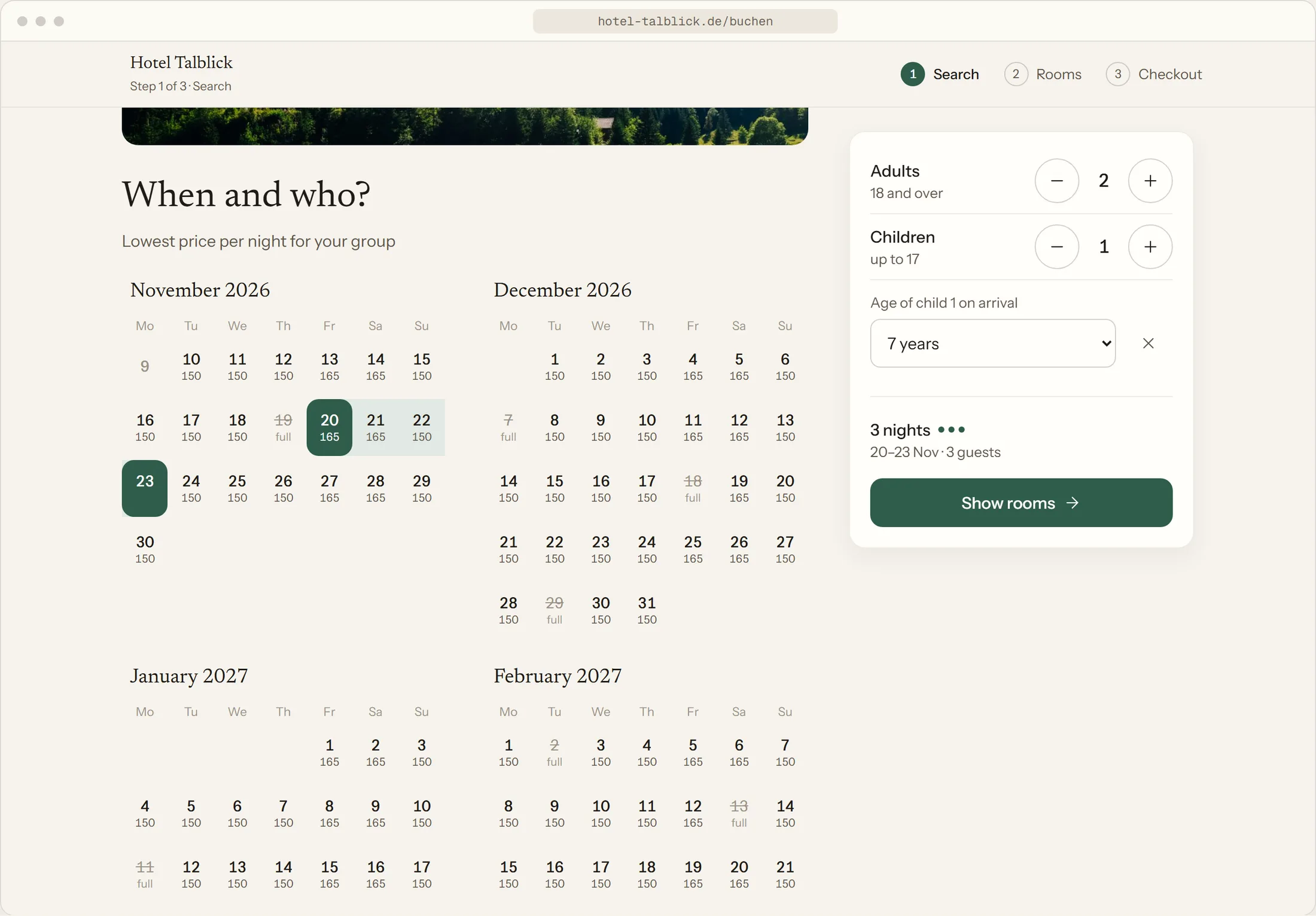
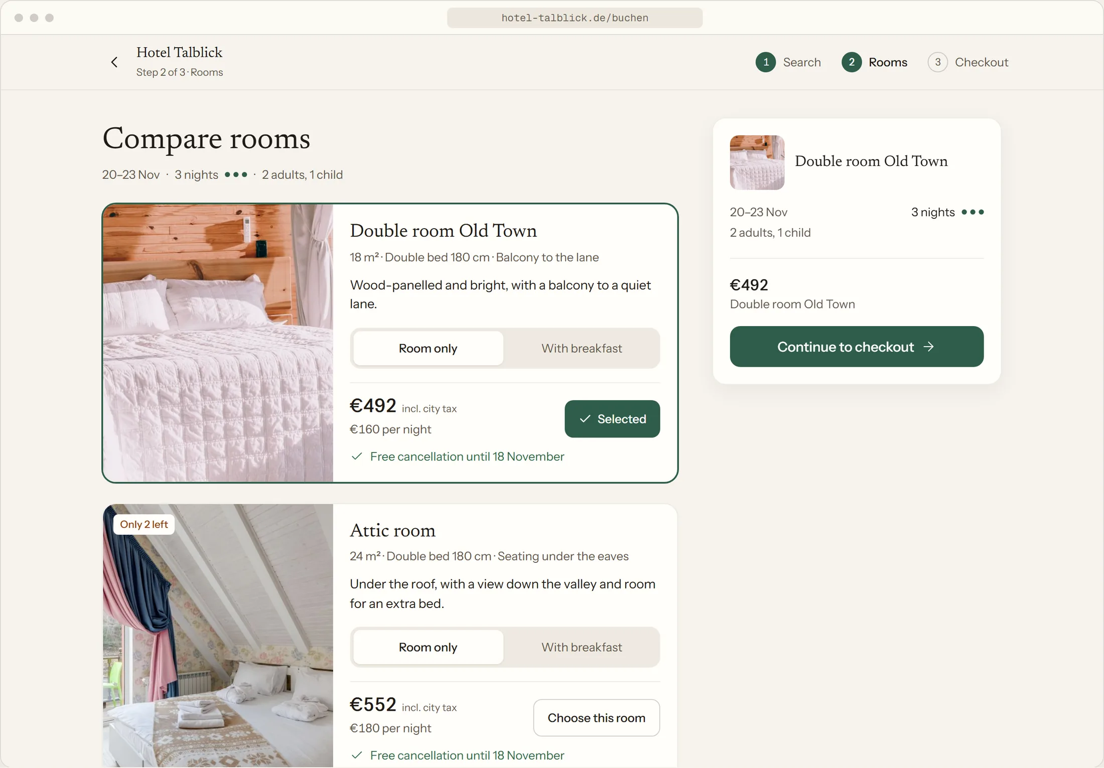
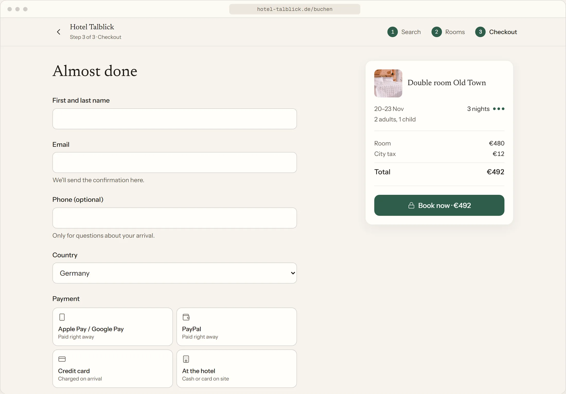
The desktop view is not a second flow but the same three steps with more room. Once the app is at least 768 px wide, every step gets two columns: content on the left, a panel on the right that stays in place while scrolling.
Before, desktop is the only view with a progress bar (“13 %”) and otherwise follows the same sequence as on a phone. There is no sketch here: in the audit I clicked through the old flow on a phone and only glanced at desktop.
What changed
- The panel on the right takes over from the fixed bar at the bottom of the phone: summary, price and the one action of the step.
- In the search the guests sit in the panel, and the calendar shows two months side by side.
- Room cards lie sideways, photo on the left, facts and price on the right, so two rooms fit on the screen at once.
- In checkout the list of all items is always open next to the form, which is limited to a readable width.
- The header names the three steps instead of showing short bars.
Why
A computer has no thumb zone, but room to compare. The action still stays in one fixed place, so nobody has to look for it. And because both views use the same building blocks, there is only one flow to maintain.
After booking
What the booking doesn't need comes afterwards
The old form asked for fellow guests and birthdays before booking (checkout sketch, mark 2), and the arrival time was a request in the footer. I didn't see the old confirmation page, because I stopped before submitting.
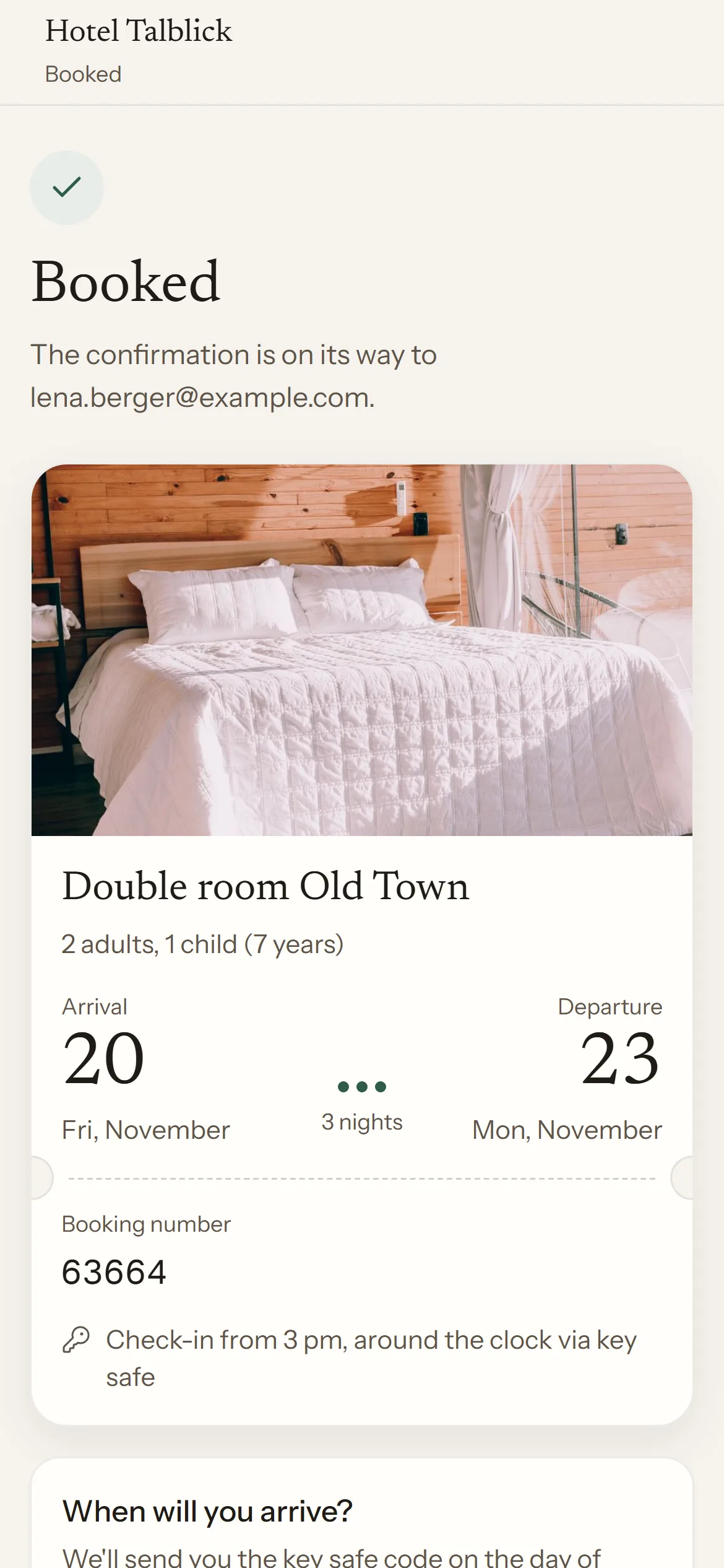
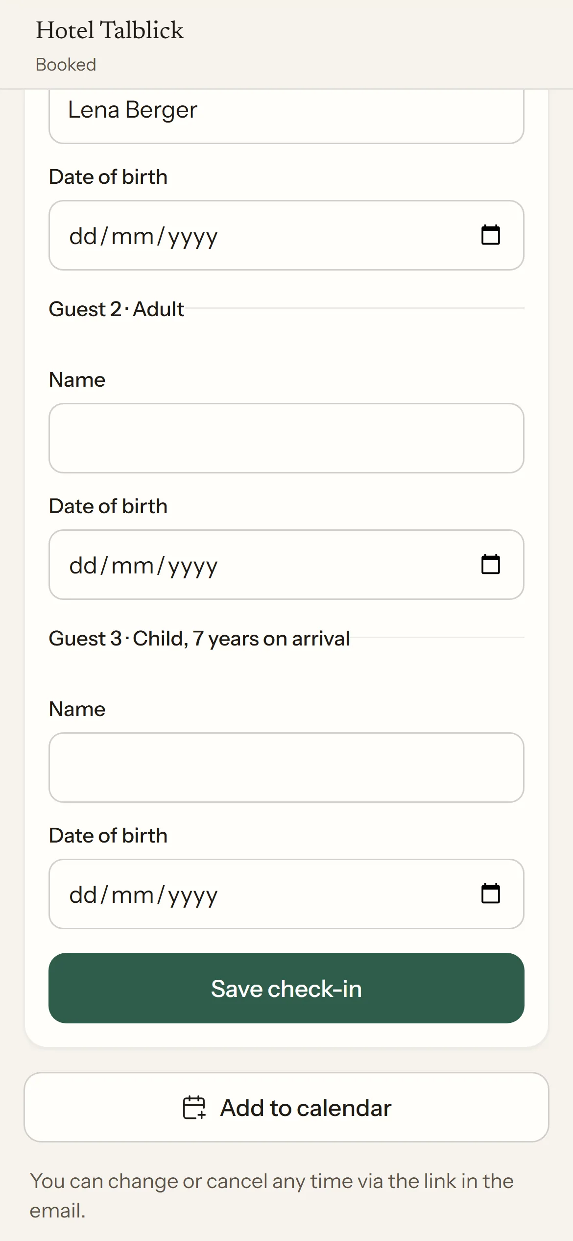
In the prototype the booking is done with three required fields. The confirmation then shows the stay as a reservation slip and offers two things the hotel really needs: the rough arrival time, so the key safe code arrives in time, and online check-in for the registration form.
In the check-in every guest is marked as adult or as a child with their age on arrival, and the first guest carries the name from the booking. Both are optional and can be done until arrival.
Its own face for every hotel
The flow runs on the websites of many hotels, so it has to adapt to each one. The fictional Hotel Talblick shows how that can look: warm linen tones with fir green as the only accent, Instrument Sans for the interface and Newsreader for headings.
One detail runs through every step: one dot per night. It sits next to the number of nights in the search, the rooms, the checkout and on the slip, so the length of the stay reads at a glance.
Before measured on 9 November 2026, on a phone
Result
Limits and what I'd do next
- Not tested with guests: The improvements come from the audit and known patterns. Next I'd have five people book with the old and the new flow on their own phones and compare time, errors and drop-offs.
- Before only up to the guest details: I stopped before submitting. I don't know the old flow's error messages, summary or confirmation.
- Desktop less tested: The two-column view came after the mobile one and has been tested less. I didn't check tablet widths.
- Everything simulated: Prices, availability and payment are made up. I didn't look at the hotel's side: administration, rates and interfaces.
What I take away
Most of the improvements are not new features but a different order: the right question at the right time, a price that no longer rises, and everything the booking doesn't need afterwards. On a phone, that is exactly what decides whether people book.
Next project